CSS Tutorial
Introduction
HTML is used to create the structure of the website while CSS is used to stylize the website. As mentioned in the HTML tutorial, the body tag <body> in the HTML file contains the core code of the website. The body tag <body> then has different divisions (div) that make up the website such as the header, navigation bar, content, and footer. The CSS code is used to stylize the HTML file by modifying tags, classes, or ids. Linking the CSS file to the HTML file is done by using the link tag <link> in the head tag <head> of the HTML file. Once the CSS file is linked, one can modify the CSS file and the HTML file will update automatically with the new styles. A CSS file can be created by changing the text file extension of .txt to .css. A basic text editor can then be used to begin coding.
Basic Syntax
CSS allows for the customization of HTML tags by making it easier to edit all of the tags of a certain type at the same time. You can stylize a certain tag in the CSS file, for example, the paragraph tag <p> and all the paragraph tags in the HTML will be updated at the same time. No need to edit every single paragraph tag in the HTML file. You can also create ids and classes in the CSS file that only apply to certain tags in the HTML file. As stated in the HTML tutorial: an id (#idname) is unique as it can be used to link to a specific part of the website such as the #header. A class (.classname) can be applied to multiple tags and is not unique. Both can be customized with the same attributes as CSS sees no difference between them from a styling perspective. I will mainly be using .classname in this tutorial as it can be applied to many tags but creating an #idname uses the same syntax as a .classname that is not applied to a certain tag.
Here we will modify the paragraph tag <p> by using CSS. However, since we do not want to modify every single paragraph tag, we will make a paragraph class. In order to do this, we will open up the CSS file and create a class by using the following syntax: tag.classname. Otherwise if left the paragraph tag by itself in CSS, all paragraph tags will be affected even the one I am currently writing in. Here we created a paragraph tag class and called it paratest by writing p.paratest in the CSS file. This class has a background color of #02547D and a font color of #02BEC4. The HTML file calls this specific paragraph class with the code <p class="paratest"></p>. The output can be seen below.
CSS Code to Edit All Paragraph Tags <p>:p {
background-color:#02547D;
color: #02BEC4;
}
CSS Code to Only Edit Paragraph Tag Class paratest:
p.paratest {

							background-color:#02547D;
	  							color: #02BEC4;
	  						}
HTML Code:
<p class="paratest"> Hello, this paragraph has a background color of #02547D and a text color of #02BEC4.</p>
Output:
Hello, this paragraph has a background color of #02547D and a text color of #02BEC4.
You can also call multiple classes within the same tag. Below we have two paragraph tag classes with different parameters. The HTML file then calls both classes by including both names in the class parameter: <p class="paratest paratest2"></p>. This paragraph tag now has both CSS paragraph styles: paratest modifies the background color and font color while paratest2 modifies the font size and font family.
CSS Code:p.paratest {
background-color:#02547D;
color: #02BEC4;
}
p.paratest2 {
font-size:24px;
font-family: "Impact";
}
HTML Code:
<p class="paratest paratest2"> Hello, this paragraph has a background color of #02547D, a text color of #02BEC4, a font size of 24px, and the Impact font family.</p>
Output:
Hello, this paragraph has a background color of #02547D, a text color of #02BEC4, a font size of 24px, and the Impact font family.
Another way of creating classes is by making classes that do not pertain to a certain tag but to any tag that calls that class. Here we have a class which can pertain to any tag that calls it by having the syntax of just .classname instead of tag.classname. The HTML code then calls on all three classes for the paragraph tag by including the .aligntest class which can be called by any other tag as well. I also included an h1 tag <h1> that calls the class .aligntest class as well. As one can see, both the paragraph tag and h1 tag are now aligned to the right. However, if the h1 tag calls the paragraph specific classes, they will not work as seen below.
CSS Code:p.paratest {
background-color:#02547D;
color: #02BEC4;
}
p.paratest2 {
font-size:24px;
font-family: "Impact";
}
.aligntest {
text-align: right;
}
HTML Code:
<p class="paratest paratest2 aligntest"> Hello</p>

							<h1 class="paratest paratest2 aligntest"> Hello</h1>
Output:
Hello
Hello
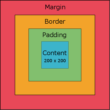
I will now go over the box format which is useful when creating the structure of your webpage. Here we have a class that can be called by any tag that has a specified width and height of 200px by 200px. The border of each side is stylized by specifying its width, color, and style. Each side is specified by top, right, bottom, and left. We also can also modify the padding and margin of this box as well by using the same syntax of top, right, bottom, and left. The padding is the space between the content and the border of the tag. The margin is the space between the border and the other tags. Below is a diagram of what the box layout looks like. I have used the following color scheme from the Adobe Color Wheel website I showed before FINAL CREATIVEMIND COLOURS.
The image below is assuming all the padding, borders, and margins are the same width but they can individually be customized as seen in the CSS code below. You can also modify the border corners by making them have a radius and make the box have a shadow. The parameters for the box shadow in the CSS code from left to right are: the horizontal offset (a greater number moves the shadow to the right), vertical offset (a greater number moves the shadow downwards), the blur radius (a greater number increases the blur), the spread radius (a greater number increases the size of the shadow), and the shadow color.
One can also simplify the CSS code by stating all the values of the parameters in one line. For example, all the border width sizes are specified in one line using the border-width CSS command instead of one CSS command for each border width. The order of the border, padding, and margin commands is top, right, bottom, and left. As for the corners, it is top left, top right, bottom right, and bottom left. The selection starts on the top or top left corner and goes in the clockwise direction. You can also put the width, style, and color on the same line for each side as seen in .boxtest3. If one would want all the sides to be the same, only one value can be entered i.e. border-width: 10px; instead of border-width: 10px 20px 40px 80px;. As seen below, the .boxtest, .boxtest2, and boxtest3 classes yield the same result except the CSS codes for two of them take up a lot less space.
Box Layout
CSS Code:
.boxtest {

							    background-color:#16434B;
								width: 200px;
								height: 200px;

								border-top: 10px;
								border-top-color: #E94858;
								border-top-style: solid;

								border-right: 20px;
								border-right-style: dashed;
								border-right-color: #F3A32A;

								border-bottom: 40px;
								border-bottom-style: dotted;
								border-bottom-color: #82BF6E;

								border-left: 80px;
								border-left-style: double;
								border-left-color: #3CB4CB;

								padding-top: 10px;
								padding-right: 20px;
								padding-bottom: 40px;
								padding-left: 80px;

								margin-top: 10px;
								margin-right: 20px;
								margin-bottom: 40px;
								margin-left: 80px;

								border-top-left-radius: 10px;
								border-top-right-radius: 20px;
								border-bottom-right-radius: 40px;
								border-bottom-left-radius: 80px;

								box-shadow: 10px 20px 10px 20px #59268C;

	  						}


	  							.boxtest2 {

	  							  background-color:#16434B;
								  width: 200px;
								  height: 200px;

								  border-width: 10px 20px 40px 80px;
								  border-style: solid dashed dotted double;
								  border-color: #E94858 #F3A32A #82BF6E #3CB4CB;

								  padding: 10px 20px 40px 80px;

								  margin: 10px 20px 40px 80px;

								  border-radius: 10px 20px 40px 80px;

								  box-shadow: 10px 20px 10px 20px #59268C;

	  						}


	  							.boxtest3 {

	  							  background-color:#16434B;
								  width: 200px;
								  height: 200px;

								  border-top: 10px solid #E94858;
								  border-right: 20px dashed #F3A32A;
								  border-bottom: 40px dotted #82BF6E;
								  border-left: 80px double #3CB4CB;

								  padding: 10px 20px 40px 80px;

								  margin: 10px 20px 40px 80px;

								  border-radius: 10px 20px 40px 80px;

								  box-shadow: 10px 20px 10px 20px #59268C;

	  						}
HTML Code:
<div class="boxtest"> Hello. This is a test. Hello. This is a test. Hello. This is a test.</div>

							<div class="boxtest2"> Hello. This is a test. Hello. This is a test. Hello. This is a test.</div>

							<div class="boxtest3"> Hello. This is a test. Hello. This is a test. Hello. This is a test.</div>
Output:
You can also modify tags by having a parent tag class and specifying a child tag underneath it such as tag.classname tag. Any tag underneath the parent tag with that specific class name will be modified as such. Here we give an unordered list a class (ul.listtest) and edit any list item under this unordered list class (ul.listtest li). Any list item underneath the unordered list class .listtest will have roman numerals as its bullet points in the code below.
CSS Code:ul.listtest li {
list-style:upper-roman;
}
HTML Code:
 <ul class="listtest>

							<li> This is an unordered list</li>
							<li> Which has "turned into" an ordered list</li>
							<li> By using CSS</li>
							<li> One more item</li>

							</ul>
Output:
- This is an unordered list
- Which has "turned into" an ordered list
- By using CSS
- One more item
Here we are making any hyperlink tag <a> under any list item tag <li> which is under any unordered list <ul> with the .listtest class to have a certain style. I also added a hover effect to the hyperlink tag when the pointer hovers over it using the tag:hover syntax
CSS Code:ul.listtest li {
list-style:upper-roman;
}
ul.listtest li a {
background:#1C1E1F;
color:#555555;
font-size: 36px;
}
ul.listtest li a:hover {
background-color: #E94858;
color:#F3A32A;
font-size: 50px
}
HTML Code:
 <ul class="listtest>

							<li> This is an unordered list</li>
							<li> Which has "turned into" an ordered list </li>
							<li> With different list items which now includes a link to the home page with a hover effect</li>
							<li> <a href="index.html" target="_blank">Home </a> </li>

							</ul>
Output:
- This is an unordered list
- Which has "turned into" an ordered list
- With different list items which now includes a link to the home page with a hover effect
- Home
Code Used for This Website
In this section I will show you what kind of CSS stylizations I have done in order to create this website. There are a great amount of customizations you can do using CSS that can create very unique websites. I will show you what I did to my specific tags and you can see the outcome on the website you are currently on.
Body - Header
The header id #header CSS code can be seen below. The width is set to 100% so it can grow or shrink according to the window size. Every other command has been covered in the examples before. I could have put the text-align:center; in the #header id instead of the h1 tag style property but it works either way.
CSS Code:#header {
width: 100%
height:200px;
background: #0c1021;
color:#ccc;
border-bottom:10px solid #577f99;
padding: 10px;
}
HTML Code:
 <div id="header">

							<h1 style="text-align:center;"> Welcome!</h1>
							</h1>
Output:
Welcome!
Body - Navigation Bar
The navigation bar had some modifications done to the W3Schools navigation bar tutorial (How To Create a Hoverable Dropdown Menu) and uses their sticky navbar (How To Create a Sticky Navbar). I have broken up each CSS code into sections below.
HTML Code:<div id="navbar">
<div class="homebutton">
<a href="index.html">Home</a>
</div>
<div class="dropdown">
<button class="dropbtn">Website Tutorial</button>
<div class="dropdown-content">
<a href="websitesetup.html">Getting Started Using Amazon Web Services</a>
<a href="htmltutorial.html">HTML</a>
<a href="csstutorial.html">CSS</a>
</div>
</div>
<div class="dropdown">
<button class="dropbtn">Arduino Projects</button>
<div class="dropdown-content">
Add rest of links here etc
</div>
</div>
</div>
The first step in creating the navigation bar was making the navigation bar id #navbar. We use an id here and not a class because there is only one navigation bar. The main purpose of this id is to create a division to hold all the navigation buttons. The HTML code below includes an h1 tag for the sole purpose of having some text instead of leaving the navigation bar div empty.
CSS Code:#navbar {
background-color: #3E4345;
text-align: center;
}
HTML Code:
<div id="navbar">

								 <h1>Navigation Bar Background</h1>
								</div>
Output:
The home button is created by making the class .homebutton and having the .homebutton class have a hover effect. We also modify any hyperlinks within the .homebutton class to have a certain style. The display: inline-block; command allows divs to be displayed next to one another instead of being placed vertically. This is used so all the buttons are next to one another and also follow the size of the window. Cursor changes the type of pointer which is set to the default link pointer. The text-decoration: none; for the hyperlinks removes the default underline and the display: block; allows the hyperlink to take up the whole space including the padding. Note that the text isn't aligned in this example because it is not inside the #navbar div which has the text-align: center; property.
CSS Code:.homebutton {
background-color: #1C1E1F;
color: white;
font-size: 16px;
border: none;
cursor: pointer;
min-width: 160px;
display: inline-block;
}
.homebutton:hover {
background-color: #0B3F45;
}
.homebutton a {
color: white;
padding: 16px;
text-decoration: none;
display: block;
}
HTML Code:
<div class="homebutton">

							<a href="index.html">Home</a>
							</div>
Output:
The customization of the dropdown menu buttons can be seen below. The class .dropdown encapsulates all the items for the dropdown menu. The class .dropbtn contains the text of the main button (e.g Website Tutorial). The class .dropdown-content then holds all of the hyperlinks for that dropdown menu. The position: relative; command for the .dropdown class allows for the text of the .dropdown-content class to stay within the width of the .dropbtn class. The position: absolute; command for the .dropdown-content class allows for the hyperlinks to display beneath the navbar instead of expanding the navbar and displaying in the navbar itself. The important part in creating this dropdown menu is to have the .dropdown-content class display: none; until the user hovers over the .dropdown class and changes the viewing option to display: block;. This way, the hyperlinks in the dropdown content class are not displayed until the user hovers over the dropdown class. The z-index: 1; allows for the currently selected .dropdown-content buttons to be on top of the page in case the window is resized and other buttons start overlapping one another.
CSS Code:.dropdown {
position: relative;
display: inline-block;
}
.dropdown:hover .dropbtn {
background-color: #0B3F45;
box-shadow: 0px 0px 10px 3px #1C1E1F;
}
.dropdown:hover .dropdown-content {
display: block;
}
.dropbtn {
background-color: #1C1E1F;
color: white;
padding: 16px;
font-size: 16px;
border: none;
cursor: pointer;
min-width: 160px;
}
.dropdown-content {
display: none;
position: absolute;
background-color: #1C1E1F;
min-width: 160px;
box-shadow: 0px 5px 10px 3px #1C1E1F;
z-index: 1;
}
.dropdown-content a {
color: #ccc;
padding: 16px;
text-decoration: none;
display: block;
}
.dropdown-content a:hover {
color: #ccc;
background-color: #126872;
}
HTML Code:
<div class="dropdown">

							<button class="dropbtn">Website Tutorial</button>
							<div class="dropdown-content">
							<a href="websitesetup.html">Getting Started Using Amazon Web Services</a>
							<a href="htmltutorial.html">HTML</a>
							<a href="csstutorial.html">CSS</a>
							</div>
							</div>
Output:
The scrolling navigation bar is from the W3School's tutorial How To Create a Sticky Navbar. It requires some JavaScript code (placed in the script tag <script>) that can be located at the bottom of the body tag <body>. The class .sticky has the position: fixed; command which fixes the position of whatever tag calls the .sticky class to top: 0; which is the top of the page. The JavaScript code then adds the class .sticky to the #navbar under certain conditions. The window.pageYOffset states how many pixels have been scrolled and compares it to the variable var sticky = navbar.offsetTop which checks the top position of the var navbar = document.getElementById("navbar"); which is the navbar id. In the end, the scroll position window.pageYOffset is compared to the top position of the navbar var sticky = navbar.offsetTop and applies the class .sticky once the scroll position is greater than or equal to the navbar top position otherwise it removes the class .sticky.
CSS Code:.sticky {
position: fixed;
top: 0;
width: 100%
}
.sticky + .content {
padding-top: 60px;
}
JavaScript Code in the HTML File:
<script>

							var navbar = document.getElementById("navbar");
							var sticky = navbar.offsetTop;
							function myFunction() {
							if (window.pageYOffset >= sticky) {
							navbar.classList.add("sticky")
							} else {
							navbar.classList.remove("sticky");
							}
							}
							</script>
Body - Content
This section will discuss the CSS code I used for the id #content of the website. This div is the bulk of the page and contains all the tutorial sections.
The id #content CSS code has a max width of 1080px and has its margins set to auto so that the left and right margins can adjust accordingly such that the content can stay in the middle of the page. It also has margins at the top and bottom to create spacing between the navbar and footer respectively.
CSS Code:#content {
max-width: 1080px;
margin: auto;
margin-top: 10px;
margin-bottom: 10px;
}
HTML Code:
<div id="content"> The bulk of the content goes in here. </div>
Output:
The title of the page (CSS Tutorial), which is between the #navbar and Introduction section, uses an h1 tag with center aligned text.
CSS Code:h1.title {
text-align: center;
}
HTML Code:
<h1 class="title"> CSS Tutorial </h1>
Output:
CSS Tutorial
The titles of the sections on the page (Introduction, Basic Syntax, etc.) use the h2 tag with a modified box format from the box tutorial section.
CSS Code:h2.h2section {
text-align: center;
box-shadow: 0px 5px 10px 0px #3E4345;
border-top-left-radius: 10px;
border-top-right-radius: 10px;
padding: 20px;
padding-top: 4px;
padding-bottom: 4px;
background: #577f99;
margin-bottom: 0px;
border-style: solid;
border-width: 2px;
margin-left: 10px;
margin-right: 10px;
}
HTML Code:
<h2 class="h2section"> Code Used for This Website </h2>
Output:
Code Used for This Website
The titles of the subsections on the page (Body - Header, Body - Navigation Bar, etc.) use the h3 tag with a modified box format from the box tutorial section. It is pretty much the h2.h2section class with a different color.
CSS Code:h3.h3section {
text-align: center;
box-shadow: 0px 5px 10px 0px #3E4345;
border-top-left-radius: 10px;
border-top-right-radius: 10px;
padding: 20px;
padding-top: 4px;
padding-bottom: 4px;
background: #126872;
margin-bottom: 0px;
border-style: solid;
border-width: 2px;
margin-left: 10px;
margin-right: 10px;
}
HTML Code:
<h3 class="h3section"> Body - Content </h3>
Output:
Body - Content
The class .section is used as the container for all the paragraphs, images, and codboxes related to the tutorial. These divisions connect to the bottom to the classes h2.h2section and h3.h3section. They have rounded bottom borders instead of top rounded borders in order to fit nicely with the h2 and h3 tags.
CSS Code:.section {
box-shadow: 0px 10px 50px 0px #3E4345;
border-bottom-left-radius: 10px;
border-bottom-right-radius: 10px;
padding: 20px;
padding-top: 4px;
padding-bottom: 4px;
margin-bottom: 0px;
margin-left: 10px;
margin-right: 10px;
border-style: solid;
border-width: 2px;
}
HTML Code:
<div class="section"> All the information goes in here. <br> All the information goes in here. <br>All the information goes in here. </div>
Output:
All the information goes in here.
All the information goes in here.
Body - Footer
The #footer id includes CSS code which pushes the footer to the bottom of the page even if there isn't enough content on the page. The code is from CSS-Tricks with some modifications. The .wrapper class goes around the #content id in order to achieve the sticky footer. The .wrapper class has a negative bottom margin equal to the height of the #footer id and .push class. The negative bottom margin pulls up the #footer id 100px but the .push class stops it from covering any content. The .wrapper class has a minimum height of 100% in order to cover the window with content. The line-height: 100px; makes the space used by lines in the footer 100px. This in turn causes the text to be vertically centered as the text is in the middle of the line at 50px.
CSS Code:#footer {
height: 100px;
background: #0c1021;
color:#ccc;
text-align: center;
line-height: 100px;
}
.wrapper {
min-height: 100%;
margin-bottom: -100px;
}
.push {
height: 100px;
}
HTML Code:
<div class="wrapper">

									<div id="content">
									</div>

									<div class="push"> </div>
									</div>

									<div id="footer">

									Thank you for visiting.
									</div>
Output:
Other
This section will discuss other CSS stylizations I have done for the website.
The .codebox class I have been using to display any coding on this website takes inspiration from this stackoverflow post and can be seen below. The white-space: pre-line; command allows the text to continue on a new line without including the break tag <br> and the overflow: auto; command allows the content to automatically adjust if it is too large for the .codebox class. The .tab class creates tab spacing for each line when necessary. The .code class creates the thin border around each code section.
CSS Code:.codebox {
font-family: "Terminal Dosis";
border-radius: 10px;
background-color:#0c1021;
color: #009090;
white-space: pre-line;
padding:10px;
font-size:12px;
display: inline-block;
text-align: left;
overflow: auto;
}
.tab {
margin-left: 40px
}
.code {
border-style: solid;
border-width: 1px;
margin-top: 10px;
padding-right: 10px;
padding-left: 10px;
border-radius: 10px;
}
HTML Code:
<div class="code">

									<br>
									<b> Test: </b> <br> <br>

									<code class="codebox"> .codebox {

										<div class="tab"> font-family: "Terminal Dosis";
									border-radius: 10px;
									background-color:#0c1021;
									color: #009090;
									white-space: pre-line;
									padding:10px;
									font-size:12px;
									display: inline-block;
									text-align: left;
									overflow: auto;
									</div>
									}
									</code>
									</div>
Output:
Test:
.codebox {

										  font-family: "Terminal Dosis";
										border-radius: 10px;
										background-color:#0c1021;
										color: #009090;
										white-space: pre-line;
										padding:10px;
										font-size:12px;
										display: inline-block;
										text-align: left;
										overflow: auto;

				  						}
I used the Polaroid tutorial from W3Schools for images and applied some modifications to the code. The .polaroid class is the overall division which includes the image and the .container class which contains the text. The width of each image is chosen at each .polaroid class using the style property within the tag itself as the max-width so that the image can adjust to window resizing. I gave rounded borders to the images and the .polaroid class to match the rest of the website.
CSS Code:.polaroid {
width:100%;
max-height: auto;
background-color: white;
box-shadow: 0 6px 20px 0 #000000;
border-radius: 10px;
margin: auto;
}
.container {
text-align: center;
padding: 10px 20px;
}
HTML Code:
<div class="polaroid" style='max-width: 1080px; margin: auto;'>

									 <img src="images\osd.JPG" alt="O'Shaughnessy Dam" style='width: 100%; border-top-right-radius: 10px; border-top-left-radius: 10px;'>

									<div class="container">

									<p> O'Shaughnessy Dam at Hetch Hetchy Reservoir </p>
									</div>
									</div>
Output:

O'Shaughnessy Dam at Hetch Hetchy Reservoir